

Rebranding Yerkes for a future spanning science, nature, history, and the arts
For more than a century, astronomers at Yerkes have studied the stars and helped shape our understanding of the universe. Home to the world’s largest refracting telescope, this Wisconsin landmark has an extraordinary scientific legacy. Today, its story also includes live performances, historic architecture, and grounds worth exploring.
We partnered with Yerkes to bring that bigger story into focus—with a brand and website that honor its extraordinary past and invite people into its next chapter.
The Challenge
Yerkes was known for astronomy. Its vision reached further.
Say “Yerkes,” and many people picture the Great Refractor: a historic telescope with a 40-inch lens, the largest refracting telescope ever used for astronomy.
That recognition is well earned. Research at Yerkes helped establish modern astrophysics, using photography and measurable data to study the stars. But its scientific reputation told only part of what visitors could experience today.
As Yerkes evolved, its brand needed to connect science, nature, history, and the arts in a way that felt clear and compelling. Our work needed to:
- Broaden perceptions of what people could experience at Yerkes
- Unite four areas of focus under one distinctive brand
- Make exploring, visiting, and supporting Yerkes easier
The opportunity was to give people a fuller picture—and more reasons to become part of it.
The Solution
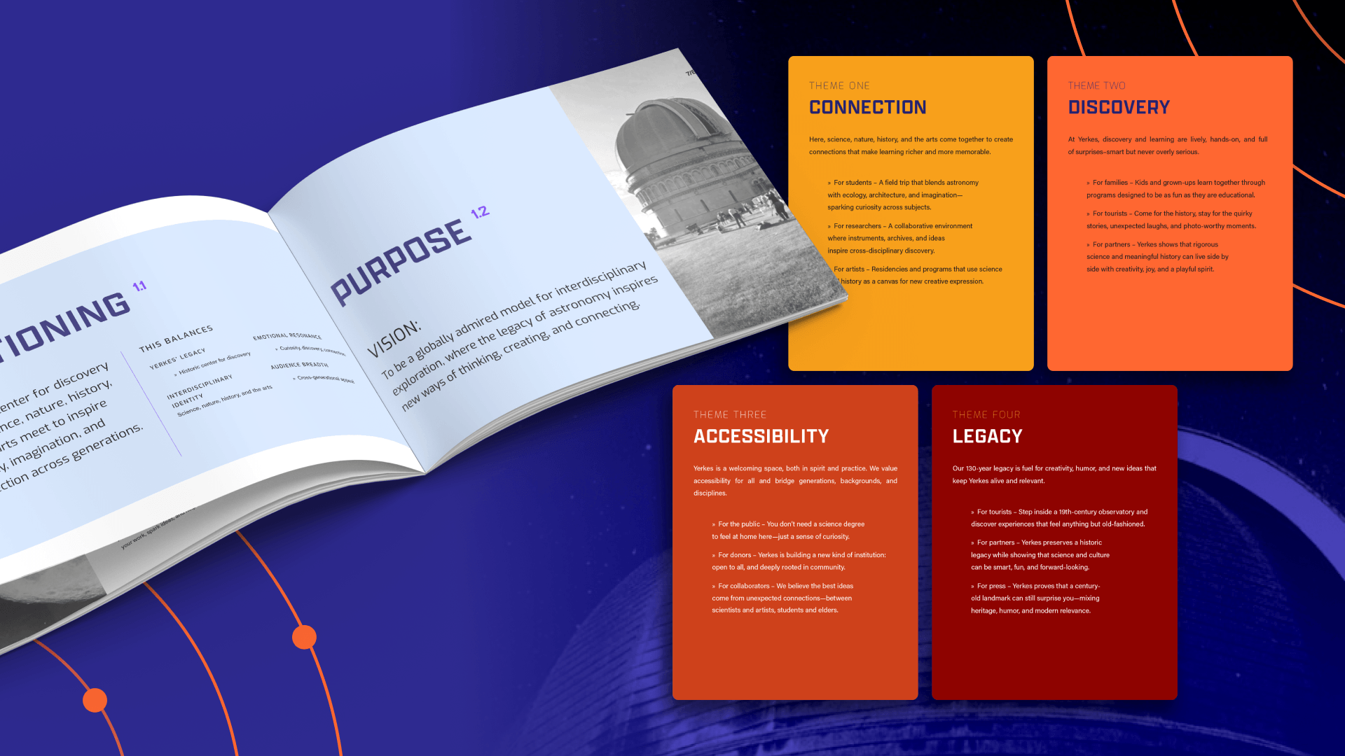
We united four areas of focus around discovery
Through conversations with staff and board members, we explored what made Yerkes distinctive, where it was headed, and what audiences needed to understand.
One idea connected its many experiences: discovery.
That became the foundation for a brand built around curiosity, connection, and possibility. It gave everything from scientific research to live performances a shared story, with room for new experiences to come.
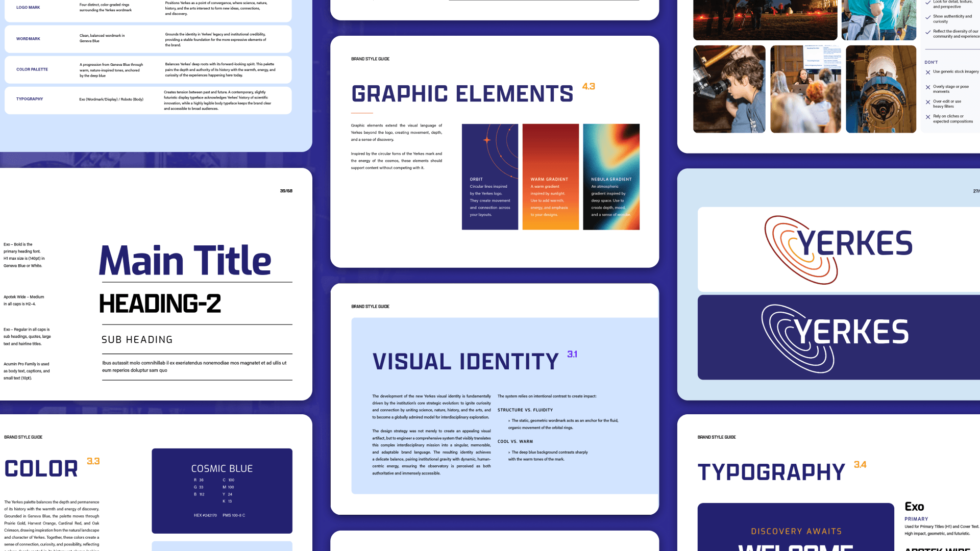
A new visual identity connected heritage with possibility
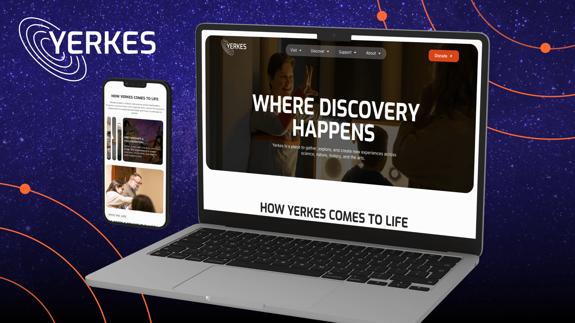
A new logo drew inspiration from Yerkes’ four areas of focus. A distinctive color palette and photography featuring people, place, and participation brought warmth and energy to the identity.
The direction balanced the stature of a historic institution with the invitation to come explore it yourself.
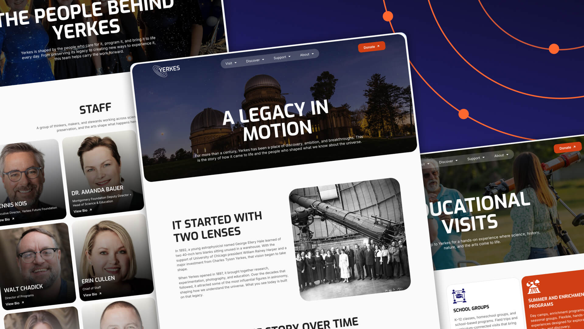
The website turned a broader story into clear ways to explore
The new website opens with an invitation:
Deeply rooted. Infinitely curious.
Science, nature, history, and the arts each have a clear place, while tours, performances, and programs offer timely reasons to visit.
Navigation centers on what people come to do: visit, discover, support, and learn about Yerkes. Focused copy and clear calls to action guide them toward booking a tour, planning an educational visit, or making a gift.
Campaign content connects those experiences to the bigger vision, showing supporters what they can help make possible.
The Result
A unified brand and website reveal the full Yerkes experience
Yerkes now has a brand that connects its many experiences and a website that makes them easier to discover.
Together, they give new visitors a fuller picture, returning guests another reason to come back, and supporters a clear view of what’s ahead.
“Our rebranding was an important step in communicating the full breadth of what Yerkes has to offer and ensuring our identity reflects not only our remarkable history, but also our vision for the future.” - Emily Irwin, Communications and Marketing Lead at Yerkes
Get in Touch
Your organization keeps evolving. Does your brand tell the whole story? Let’s bring it into focus. Get in touch to learn how.

821 E Washington Ave #200
Madison, WI 53703
608.836.7464


